If only the Egyptians had built bars…

…maybe we wouldn’t have graphs like this!

Observations from the FlowingData challenge
I wanted to share some general observations following the FlowingData challenge from last Friday which has provoked a large response.
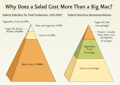
Readers were invited to comment on and offer makeover designs for the above 3D pyramid diagram which related to the US Farm Bill governing what children are fed in US schools and what food assistance programs can distribute to recipients. The graphic was taken from an article published on the Physicians Committee for Responsible Medicine (PCRM) website. Robert Kosara at EagerEyes had also picked up on the graph.
Salad vs. Big Mac?
The first observation concerns the applicability of the title ‘Why does a salad cost more than a Big Mac?’. I don’t believe this question accurately frames the nature of the article nor the information comparison being made, rather it implies that the main food group ingredients of a Big Mac receive higher subsidies than the contents of a salad and, therefore, has a lower cost to the consumer. It appears to have been used to be more appealing and less ‘dry’ than something like ‘How do federal food subsidy levels compare to nutritional recommendations?’.
The graph reveals nothing about how subsidies affect the prices of various food groups and this is what would be needed to understand the reasons for cost differences between a Big Mac and a salad. The title also has no relevance to the right-hand pyramid information around nutritional advice.
Legitimacy of comparison?
The flawed title aside, a number of people challenged the direct comparison being made between the nutritional advice and the subsidy levels, commenting that you wouldn’t expect these to be consistent and raising several influencing factors that would impact on subsidy levels. These included the affordability of the commodity, industrial competitiveness, food production costs, jobs and the economy at large. There would also be relationships between the food groups themselves, for example the grain crops will be used as feed to support the meat and dairy industries, and so the subsidy values would not be independent. As one commenter on this site (Trish) remarked, it would have been more useful to see if production levels matched the recommended proportions and if the subsidies reflect the size of the respective food group markets.
All these are entirely legitimate comments and, whilst they shouldn’t necessarily obstruct the comparison being made between the two sets of data, they should be taken fully into account when interpretations are made and conclusions drawn.
Graph designs
The majority of discussions, naturally, focused on the use of the 3D pyramids to present the subsidy and nutritional serving information as well as the merits of alternative designs. I was most interested by the divided responses I noted.
Sifting through the comments on FlowingData and the correspondence I’ve received, crudely, I’d suggest around one-third of respondents expressed positive sentiment towards the pyramids with two-thirds recommending or preferring alternative approaches. Very unscientific, of course, but that was the general feeling I picked up.
At this point it is important to remember that the demographic of those involved in this discussion will typically be people who are relatively well informed about the established principles of information design (through Cleveland, Tufte and Few etc.), so we are not necessarily talking about casual consumers of information. Given this context, it was very interesting to observe a relatively high proportion of people seeming to like (or at least not hate) the pyramids.
I say interesting rather than surprising because I have witnessed similar reactions through my own research into the issue of form vs. function of graph design. I’m currently writing an article about this study, so wont go into much detail. One of the experiments I conducted involved ‘everyday’ participants grading their aesthetic responses to a range of different graph designs. The results showed 64% exhibiting a strong preference for 3D designs. Furthermore, even when these same people subsequently experienced the challenge of interpreting values from these designs, and were shown to have performed inaccurately, many still expressed a preference for such designs.
Of course we are talking about a smaller proportion of pyramid ‘supporters’ here and many have acknowledged the flawed use of the third dimension given the encoding of the pyramid slice values were based on height rather than slice volume. But it does show that, despite an understanding of the principles behind best practice designs, people are still drawn towards supposedly flawed constructions. Whilst research conducted in subjects such as interface design has shown a strong preference towards the use of artefacts and devices with physical characteristics in the design of websites and software applications, clearly, we are still some way off fully understanding the interplay between form and function in graph design.
Several comments noted the familiarity of the pyramid and the consistency of the pyramid being used for food nutrition displays. I’ve heard similar sentiments expressed towards pie charts (unsurprisingly) as they represent physical pies or pizzas (on a side note, one of my main problems reading pie charts has always been my inability to avoid slipping into seeing it as a clock face and therefore interpreting 25% segments as 15%).
There also seemed to be a sense that the pyramids did all that was asked of them – express the headline difference between the subsidy segments and the nutritional recommendations through the inconsistent sized chunks of coloured shapes. They weren’t intending to make key decisions based on a detailed understanding of all the data, they just wanted to gain a simple feel for the profile of the two data sets. And more than anything they just liked the pyramids as a refreshing, creative difference to the ubiquitous use of a narrow range of graph types, specifically the bar/column chart in this case.
Closing comments
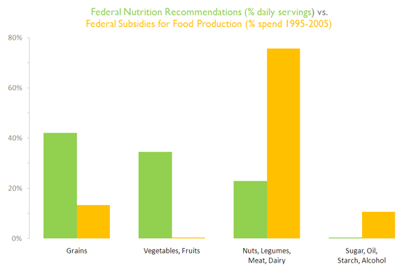
I produced the redesign below based firmly on the design principles I have learnt and been taught. My personal aim was to create a design that most effectively and efficiently presented the information. Along with many other flaws (in my mind) I felt the pyramids fundamentally wasted an opportunity to fully reveal the stark differences between the subsidy and nutritional proportions.

Some people acknowledged the need for this type of redesign, providing a nice clear and clean display, but the pyramids approach seemed to fit better with what they wanted to look at and this is at the very core of the challenge we face in this field.
The illogical irrationality and impulsiveness we see in all walks of life, how we choose to act and respond to different decision situations we face, how we are so strongly affected by gut feel and immediate taste, has such a strong grip on how we prefer to experience information presented in graphical form. We might know it is wrong, but we feel it is right.
For those of us trying to affect change, this phenomenon represents the most difficult and seemingly impenetrable issue. It is one we might need to tackle with a fresher, more flexible approach.

