
The BBC has launched its ‘Superpower’ season, broadcasting a series of interesting programmes exploring the power of the internet.
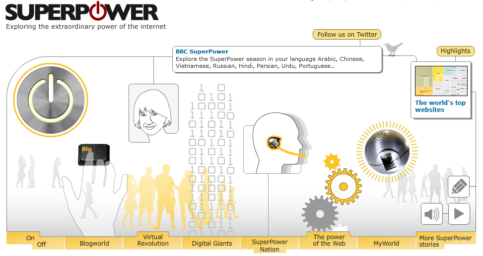
The image below is taken from the season’s dedicated mini-site. This is the primary interface for navigating around the site’s content. Hovering over each component causes it to animate creating an innovative and engaging experience. The visual design is clean, authorative and very accessible.

One of the highlighted elements of this site is the ‘Visualising the internet’ content, with a series of visualisations demonstrating its size and growth. The first of these is a treemap which breaks down the unique user proportions of the top 100 sites, grouped by category.
Strangely, the individual squares do not double-up as links to the respective sites. I understand creating a navigation interface isn’t the intention of the graphic but it would seem an obvious by-product. From a design aspect, my main problem is the arbitrary use of colour to shade some of the category collections. Dark grey, blue, yellow and orange (seemingly taken from the site’s ‘identity’ pallette) appear to represent the four categories that have an option to isolate and zoom into view them closer. However, there is no explanation to support this and these colours seem a bit meaningless.

The second visualisation I want to comment on is the world map which has a timeline sequence plotting the growth of the net around the world. The coloured areas represents the % of that country’s population who are online and the growth is presented annually from 1998 to 2008. On the face of it this is potentially a very interesting visualisation presenting a range of stories about the change in prevalence of internet access. However, its value is significantly undermined by the unusual decision to set 31%+ as the maximum encoded value. This means there is no visible difference between a country with 31% and 91% of its population online. Surely the category values should begin at 0 and go all the way, in consistently sized ranges, towards 100% or, logically, the value of the highest country proportion (as 100% is unlikely)?
