

For those people reading who frequent some of the other sites covering similar data visualisation topics you might be expecting me to include in my first post one of two things:
- A declaration of my love of Charles Joseph Minard’s graphic on Napoleon’s march to Moscow, or
- A video clip of Hans Rosling’s TEDtalk from 2006
But i’m not. Instead, my very first post is going to focus on a fusion of two topics of massive personal interest – football and graphs. Here is evidence of the sort of graph design capability that encourages people like me to start ventures like this:
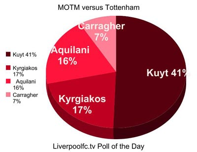
The major fatal problem here is clearly that the values add up to 81% rather than 100% which renders it totally meaningless. Clearly there were other players not listed who received votes for Man of The Match that came to an aggregate of 19% but these have been left off.
Elsewhere, other problems include the unnecessary added decoration of the third dimension which is a proven distracting property when trying to interpret accurate values. That said, we don’t really need to interpret the values given that we are told twice the proportion of votes each player received.
I share the views of the majority of subject opinion leaders with regards to the worth of pie charts – avoid where possible unless your boss’s neck veins are popping out and he’s threatening to impale you with a biro unless you follow his strict instruction. However, there are at least some positives to take out of this graph, for what it’s worth.
Despite the missing off of 19% of values at least the pie chart comprises of fewer than 5 categories. The first category starts from the vertical, 12’o’clock position which helps anchor the reading of the remaining values. Furthermore, the categories are ordered in descending values so you can clearly see the ranking of values.
Nice to leave my first post on a positive note.