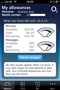
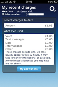
The images below show screenshots from the O2 ‘My Account’ app for the iPhone. In principle this is a very useful application to keep a close eye on your track on your available free minutes and texts and details of additional charges outside of your contract.


If you assess, however, the number of items of data that are actually being presented over the two screens it reveals not only a significant inefficiency in the use of space but also a missed opportunity to provide useful analysis.
In the next few days I’m going to work on a makeover version of this application to demonstrate the type of design and content that would enhance the value of this app greatly.

